Software Architecture Management Platform
Comprehend.dev is a B2B platform that helps teams understand and manage complex software systems by connecting architecture, documentation, and product knowledge in one place. It supports collaboration between developers, product teams, and technical stakeholders working on large and evolving products.

Research & insights
As an internal B2B platform, the primary users of the system were the team members responsible for developing and operating it. The research approach therefore relied on continuous collaboration with domain experts rather than large-scale user testing.
Structured discussions and working sessions with developers, product owners, and technical stakeholders provided detailed insight into real workflows, technical constraints, and operational dependencies. Their direct involvement in day-to-day use of the platform ensured feedback reflected actual usage patterns rather than hypothetical scenarios.
In addition, together with the lead developer I participated in a consulting collaboration with another company, where Comprehend was used in real working conditions. This provided practical validation of the product and helped uncover usability issues and edge cases through real tasks and external workflows.
These insights guided prioritization of interface improvements, clarified information hierarchy, and reduced friction in complex tasks, supporting more efficient navigation and decision-making within the system.
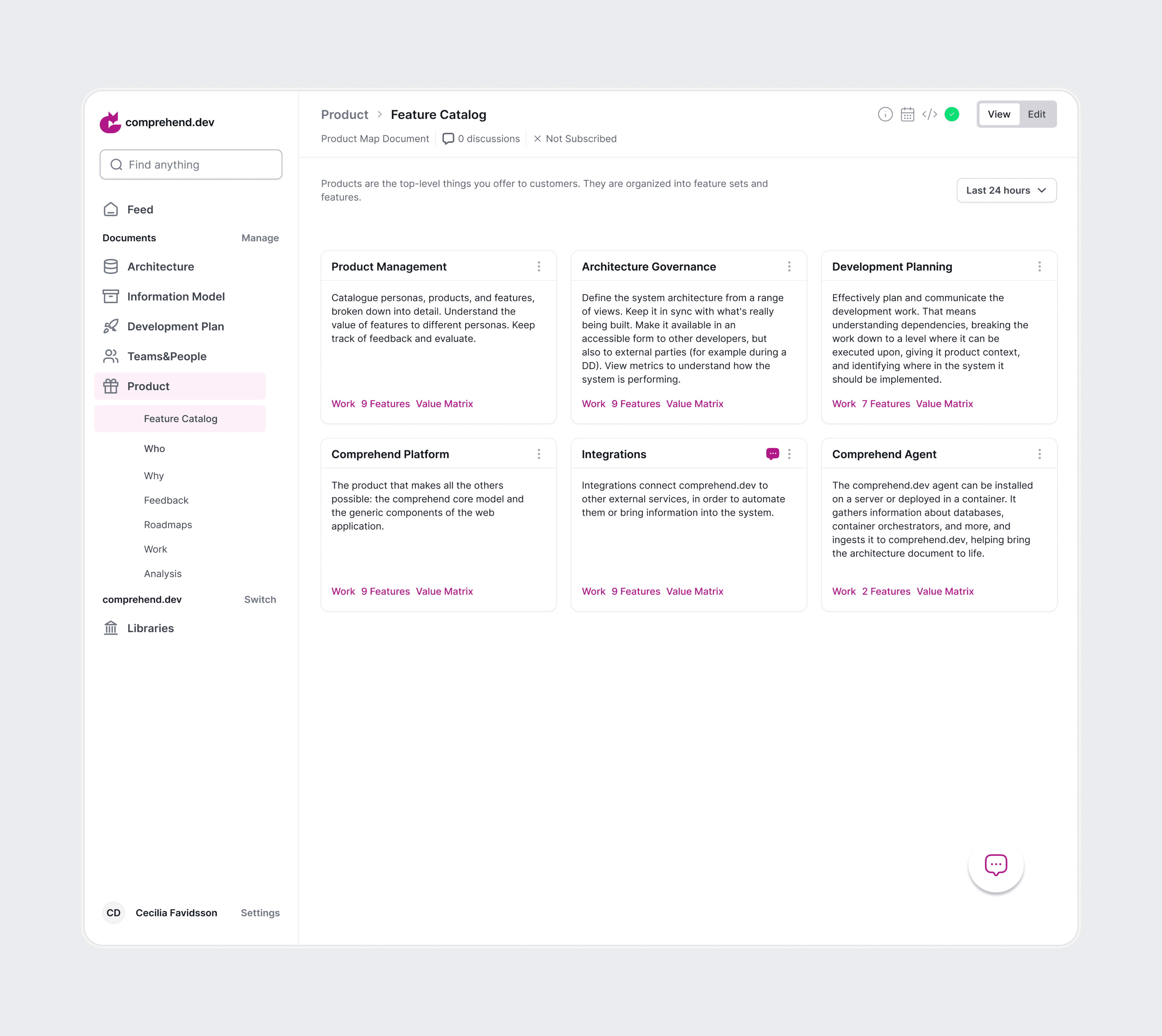
Overview interface redesign
The sidebar and top navigation were reorganized to improve hierarchy and usability. Visual noise was reduced, unnecessary backgrounds were removed, and the overall layout was simplified to create a cleaner and more focused interface. The image below shows how the overall interface looked before the redesign.
The redesigned interface introduces a clearer left-side navigation that allows users to easily switch between personal and company profiles when multiple organizations are available. A dedicated Manage action provides quick access to creating and organizing documentation.
The top navigation was structured to support faster orientation, while a global Edit Mode enables users to switch the entire workspace into editing when needed. Breadcrumbs and tab navigation help maintain context and move efficiently across sections.
Users can immediately see the number of discussions related to specific information, check subscription status, and follow updates directly from the interface. Clear error messages were also introduced to improve feedback and prevent confusion during interactions.
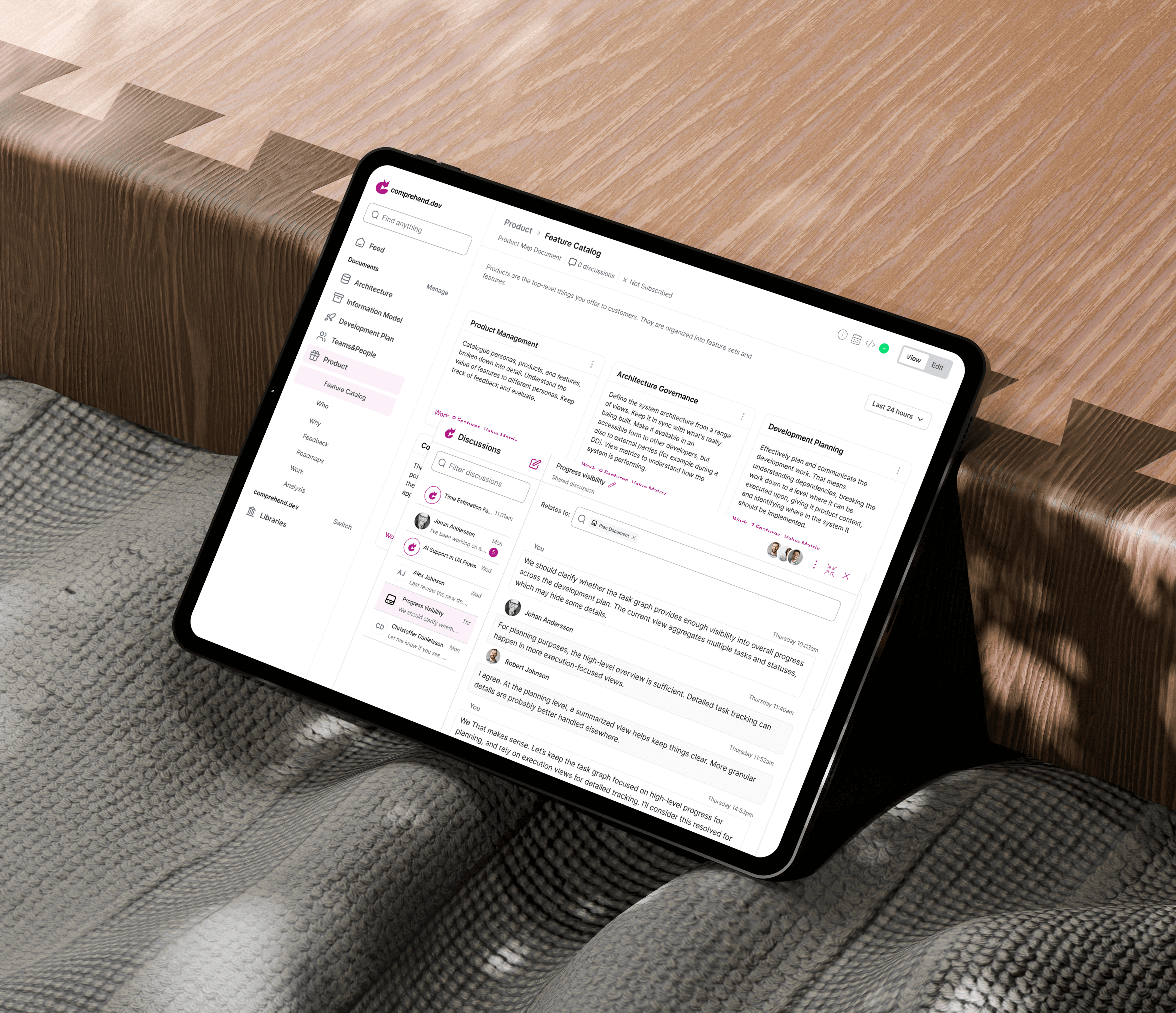
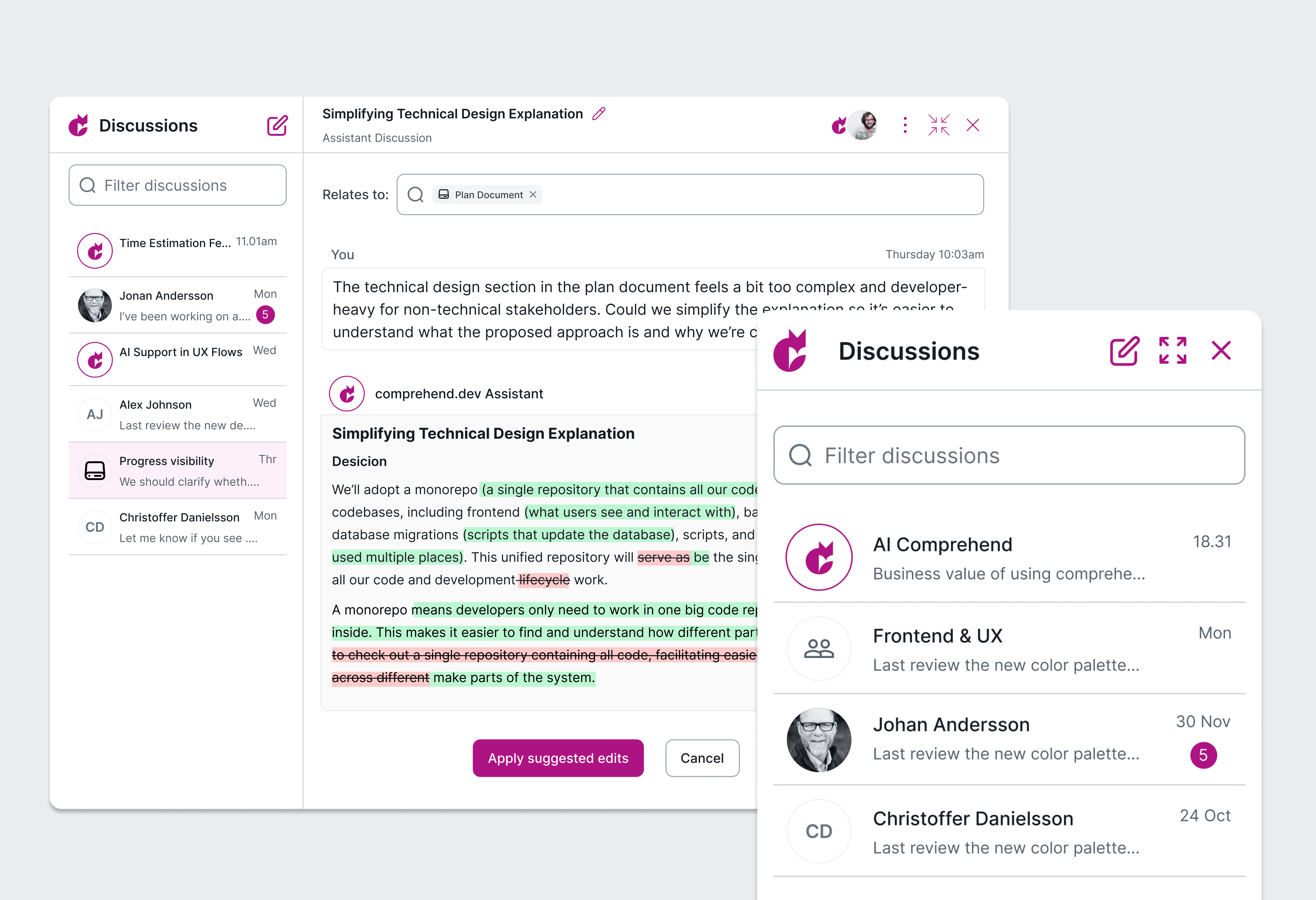
Discussions
Discussions were redesigned from a basic messaging feature into a contextual, AI-powered tool with three discussion types: Shared, Private, and AI.
The feature was removed from the main sidebar and reimagined as an AI-bot–like interface that can be opened, closed, and adjusted on demand without interrupting the main workflow.
Discussions can be linked to specific topics, helping users maintain context and structure. AI discussions allow users to ask any question and receive not only direct answers, but also alternative suggestions. To ensure transparency and trust, users can see the sources and resources the AI relies on when generating responses.
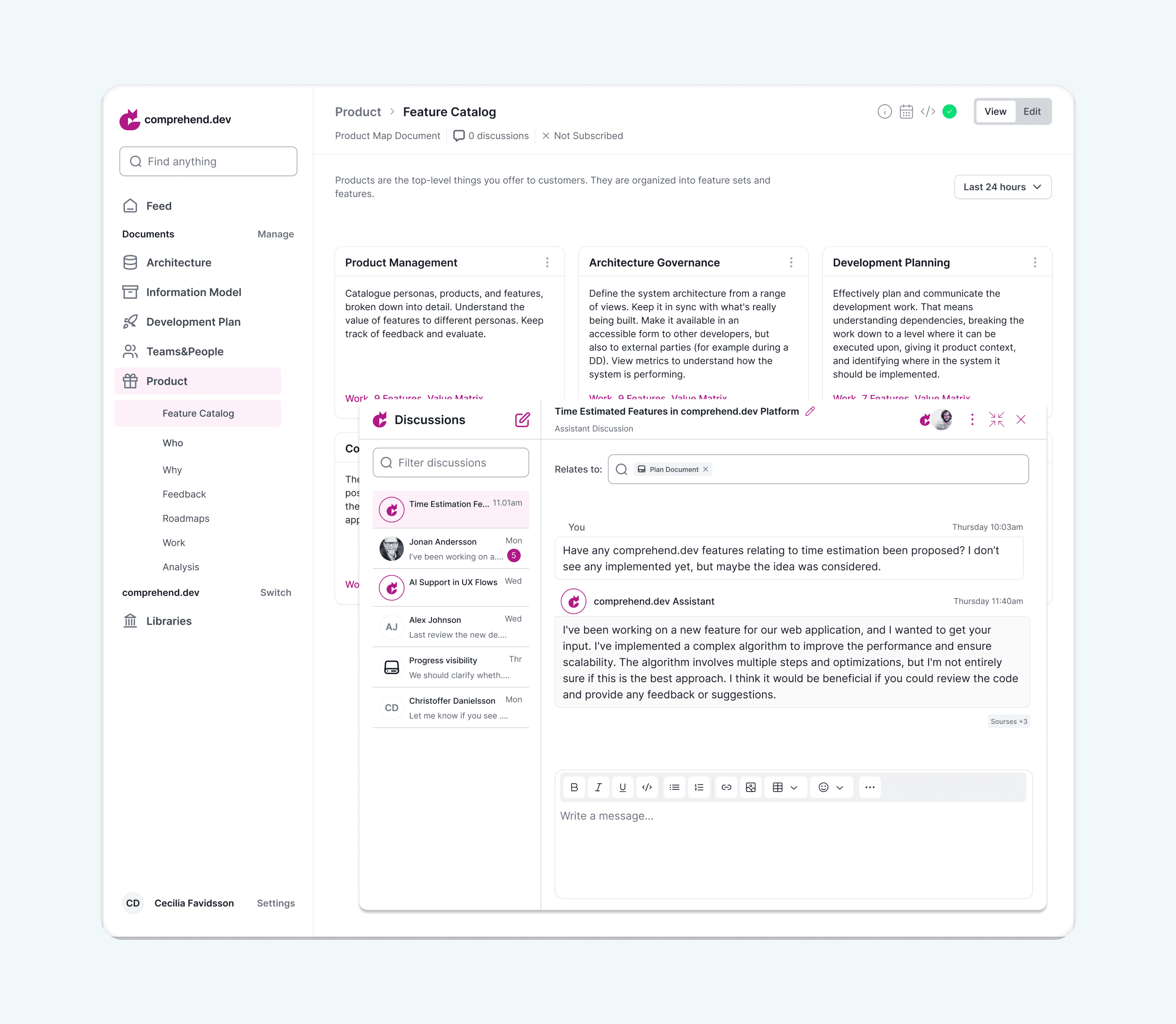
AI-assisted suggestions & alternatives.
The AI assistant not only provides direct answers, but also suggests alternative formulations, highlights improvements, and refines the original request. This helps users clarify their intent, explore different approaches, and improve the quality of technical and product-related explanations. I introduced separate editing and viewing modes to minimize distractions and make the interface easier to use for different workflows.
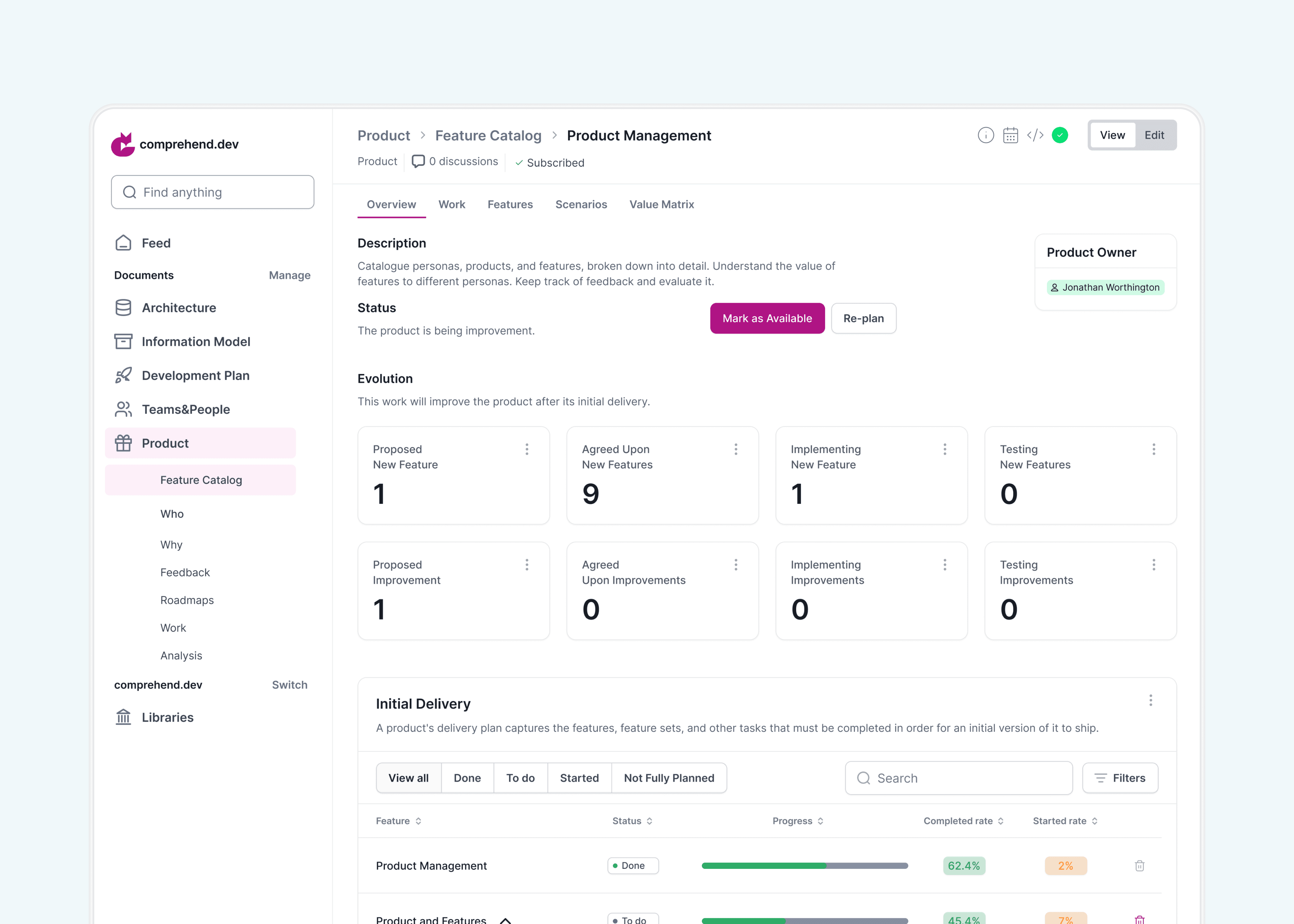
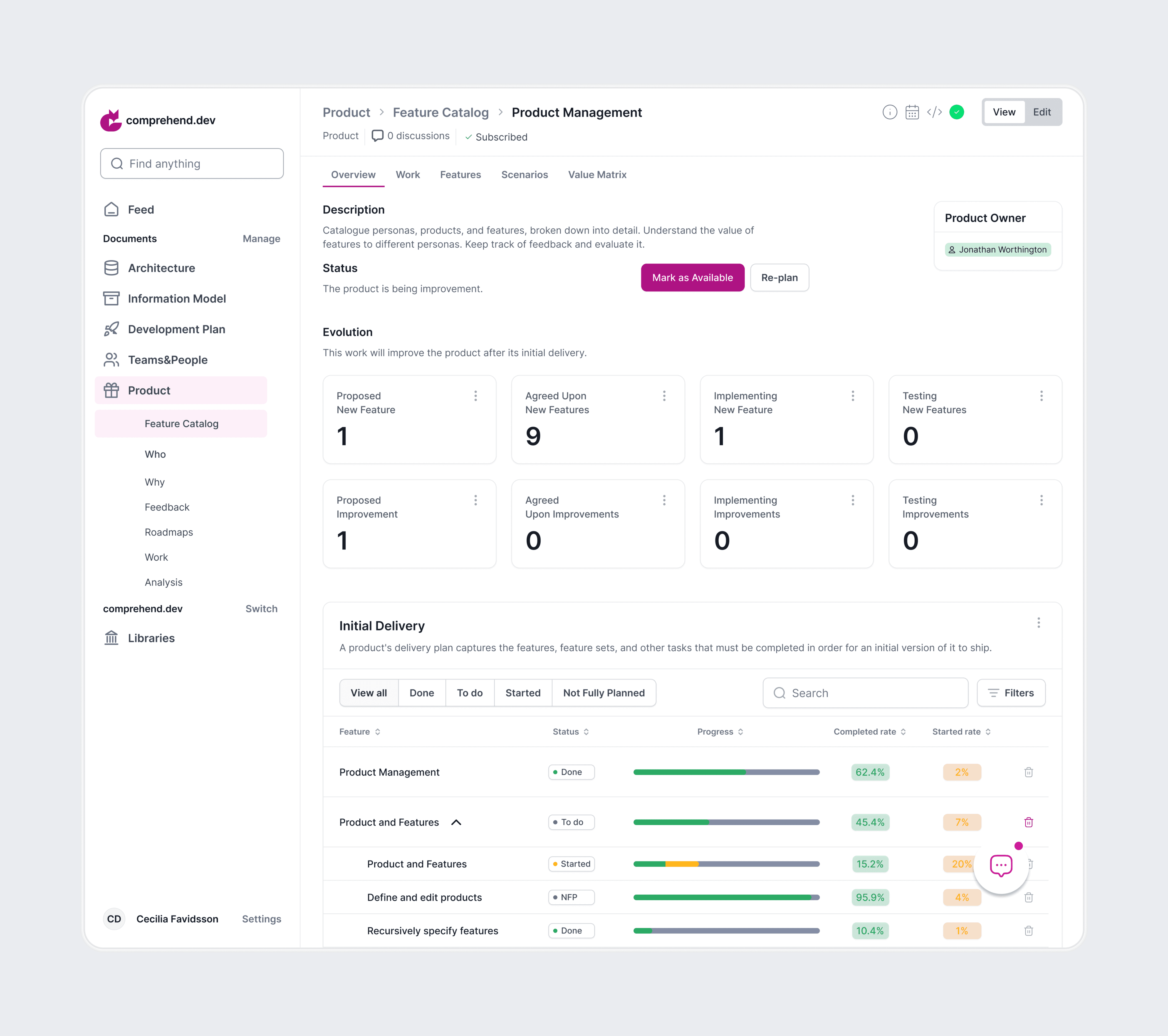
Metrics and statistics
Product metrics and statistics were consolidated into a single, structured system to improve clarity and transparency. Key statuses, progress indicators, and completion rates are presented through a clear information hierarchy and visual cues, allowing users to quickly understand the current state of the product without scanning complex tables.
The interface was designed to reduce cognitive load and support faster decision-making by making progress, priorities, and changes easy to grasp at a glance.
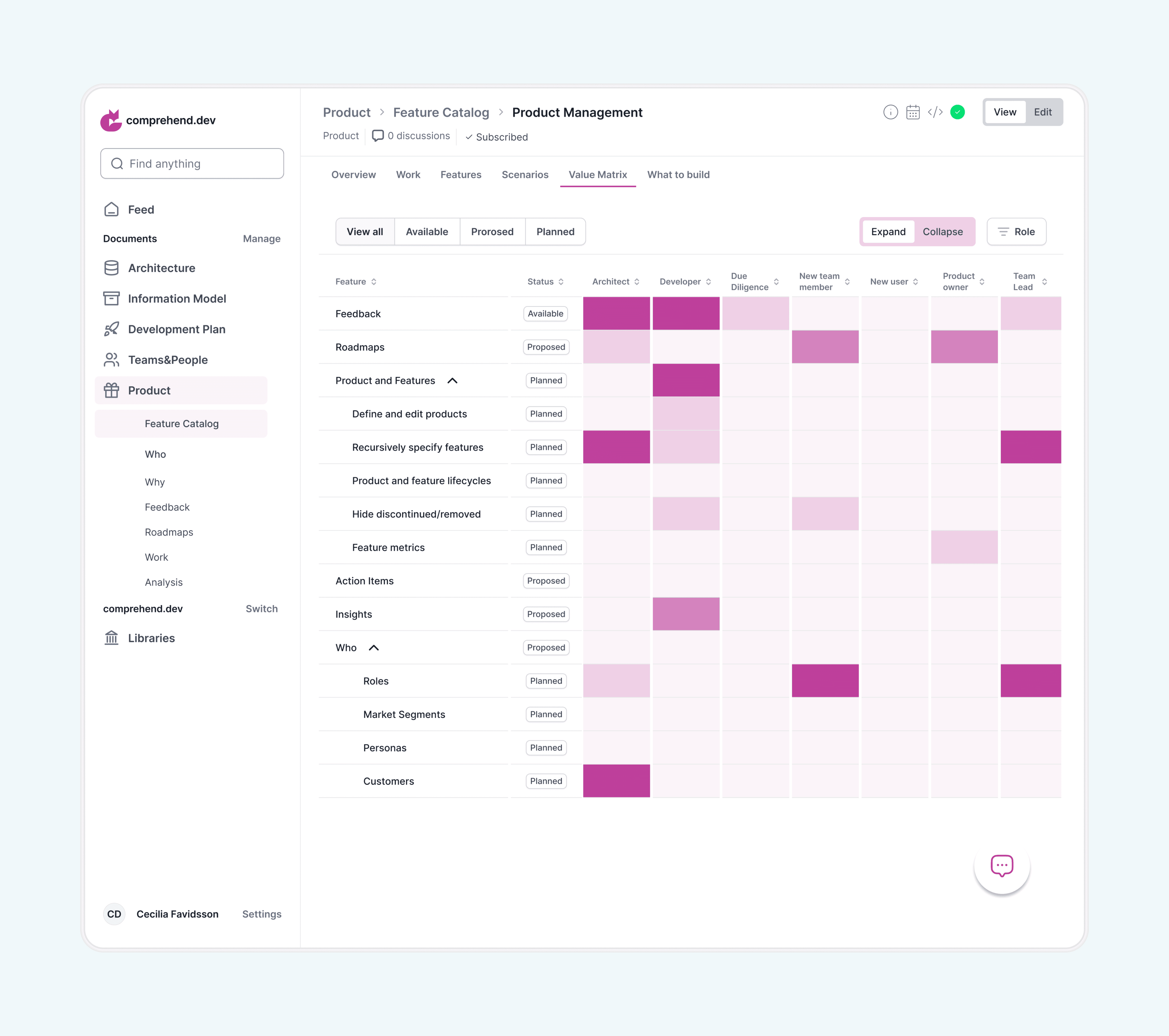
The Value Matrix maps product elements — such as features, roles, and metrics — against team responsibilities in a single structured view. Each column represents a team role, while rows reflect parts of the product.
Color intensity indicates the level of involvement, and status labels (Available, Proposed, Planned) show the maturity of each item. This helps users quickly understand ownership, identify responsibility gaps, and see what is already defined versus still in progress.
By combining responsibility mapping and progress tracking in one place, the interface reduces the need to navigate multiple documents and supports faster team alignment and decision-making.
Website
To support the product launch, I redesigned the marketing website from scratch, preparing it for the public release and first investor presentations. The goal was to clearly communicate the value of a complex technical product to a broader audience and make the platform understandable at a glance.
The new website focused on clarity, structure, and messaging — translating technical concepts into accessible explanations while highlighting key benefits and use cases. This helped position the product for early market entry and initial stakeholder engagement.